Our DataBoard mobile app has been a go-to management tool for our customers for more than a year. It presents current labor costs, current voids, current sales and a good deal more. (Maitre'D users that haven’t yet given it a spin can click here for a free 30 day trial.)
Keeping you up to date on your business was its mission and it certainly achieved that (just ask Blaine Woodfin of Sidewinders American Grill). For so many of our customers, it’s become a constant companion, delivering up-to-the-minute information about every aspect of their operation across all restaurants. And it keeps you informed, providing alerts (that you define) when any part of the business hits a threshold that needs watching (for instance, too many voids). And its speed dial features let you connect with any of your restaurants with a single touch.
Today, I want to spend a little time letting you know that DataBoard is no longer just about keeping you current.
Now, it’s a whole lot more.
We’ve updated DataBoard to make it more than a watchdog over your operation. Now it becomes part of your business analysis team too, providing you with a range of historical data that lets you see at a glance, wherever you are, how you’re doing right now, and how that compares with your historical performance.
Food Sales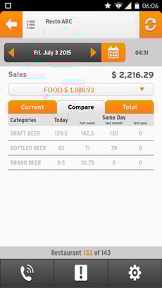
DataBoard has always delivered your current food sales for the day, by category. The latest release takes that a few steps further.
It lets you see each category’s sales performance by day, and by current week, month and year on a single screen. But, of course, knowing how you’re doing right now is only half the battle. You can’t know really whether you’re doing well unless you can measure today’s results against how you’ve done in the past. Now, DataBoard compares your current performance (day, week, month and year) against previous performance (for instance last week, last month and last year).
Labor Costs
That same historical analysis is applied to your labor costs. Log in, tap the Labor Costs icon, and you can view how those labor costs are distributed by percentage across all your categories (kitchen, management, floor and more). Then, you can compare it to the same day last week, last month and last year.
Staff Hours
You can view staff information by more than just category. You can drill down and see the hours each member of your team has currently clocked. This is truly a must-have for making sure you keep the lid on overtime, and that you’re using all your staff to their full capacity. No matter where you are, you can see which employees are being pushed to the threshold and which are underutilized, and make instant adjustments to the schedule to keep your staffing level high and your labor costs under control.
Voids
DataBoard has always kept a close eye on voids. Now, we make that even more granular. We look beyond just the totals; you can drill down on any employee and see all the details about each void. That includes what the voided item was, the time of day of the voided transaction, and the amount cancelled.
Try It Yourself
The DataBoard mobile app has proven itself to be a great tool to help you manage your operations. Now it takes on a far more strategic role in your operation. And while I’ve focused here on what’s new with the app, there’s more to the story. Start your 30-day free trial today and check it out for yourself.